Client
Edinburgh Napier University
Service Provided
Graphic Design
The Brief:
Design a visually compelling A2 poster to promote the Napier Student Film Festival 2025. The poster should creatively reflect the festival's core theme, "Bridging the Gap", which symbolises the event’s role as a launchpad for student filmmakers aspiring to enter the film industry.
1
Mood Board:
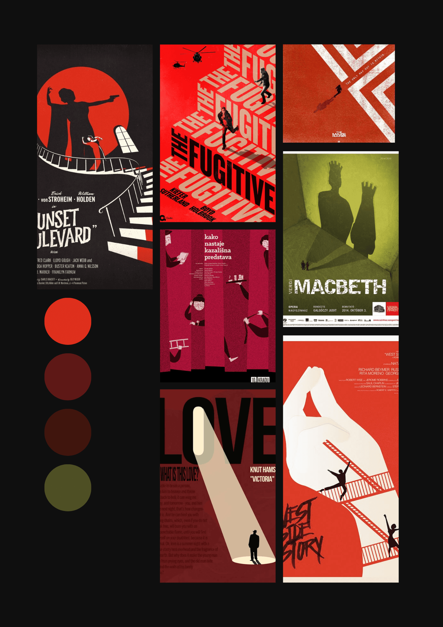
To interpret the theme visually, I created a mood board that captured ideas of transition, ambition, connection, and creative growth. I drew inspiration from cinematic imagery that suggested movement; such as bridges, tunnels, and spotlights, as well as bold typography seen in modern indie film festivals. The colour palette balanced warmth with contrast to evoke energy and focus, while recurring graphic motifs like film strips, stairs, silhouettes, and abstract bridges helped shape a unified visual language.
2
Initial Sketches
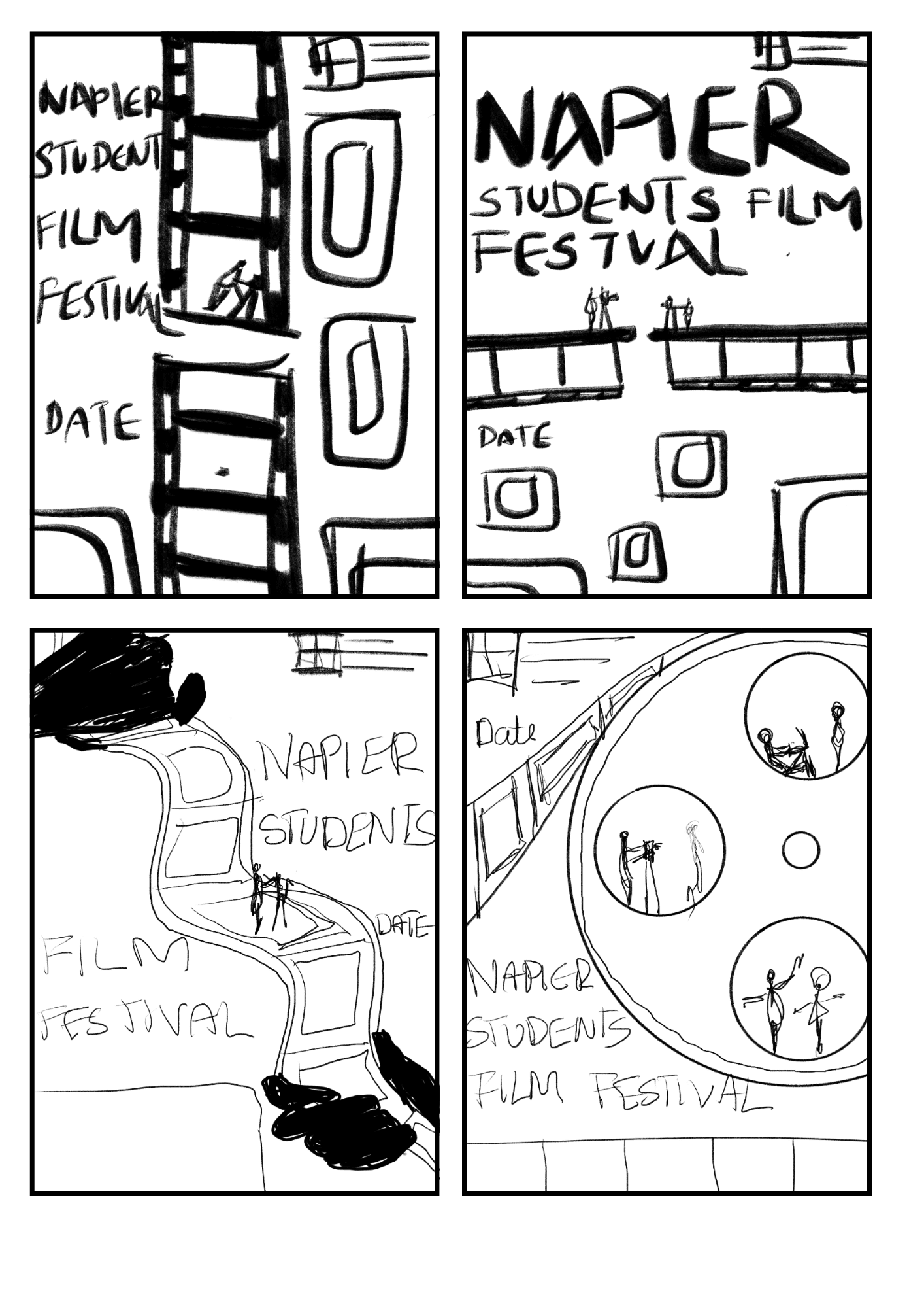
Before moving into digital design, I explored a range of rough sketches to visualise how the theme “Bridging the Gap” could take shape. These early concepts aimed to express the metaphorical connection between student filmmakers and the professional industry. Through symbolic and abstract imagery, I experimented with different ways to represent growth, ambition, and transition in a form that felt both personal and cinematic.
3
Drafts
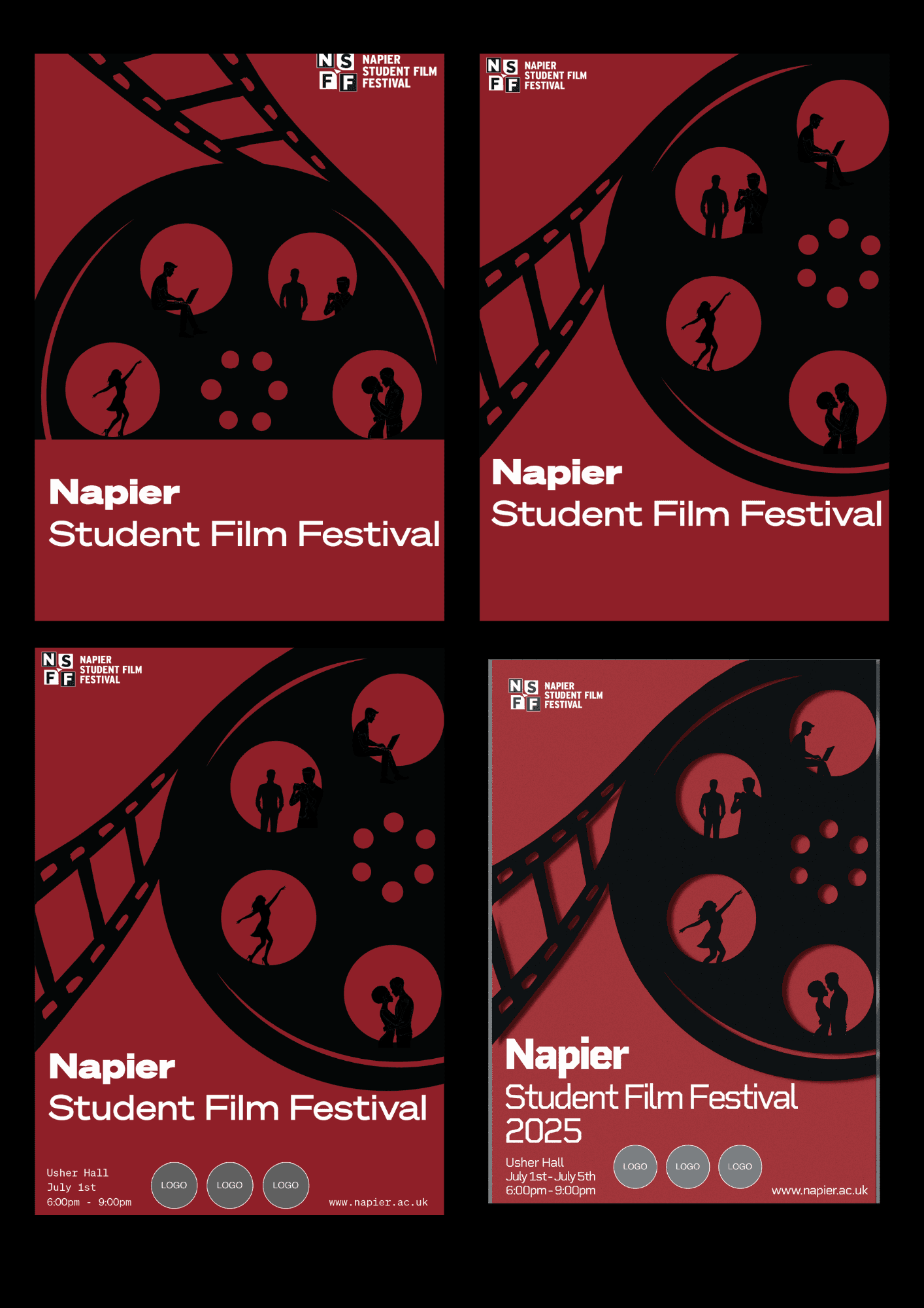
Once the concept was defined, I moved into the wireframing stage to establish the poster’s structure and visual hierarchy. This involved planning the placement of key elements—text, imagery, logos, and supporting content—while applying design principles like the golden ratio to guide the viewer’s attention. I also prioritised accessibility by testing all colour combinations for adequate contrast and readability, ensuring the design was inclusive and effective.
4
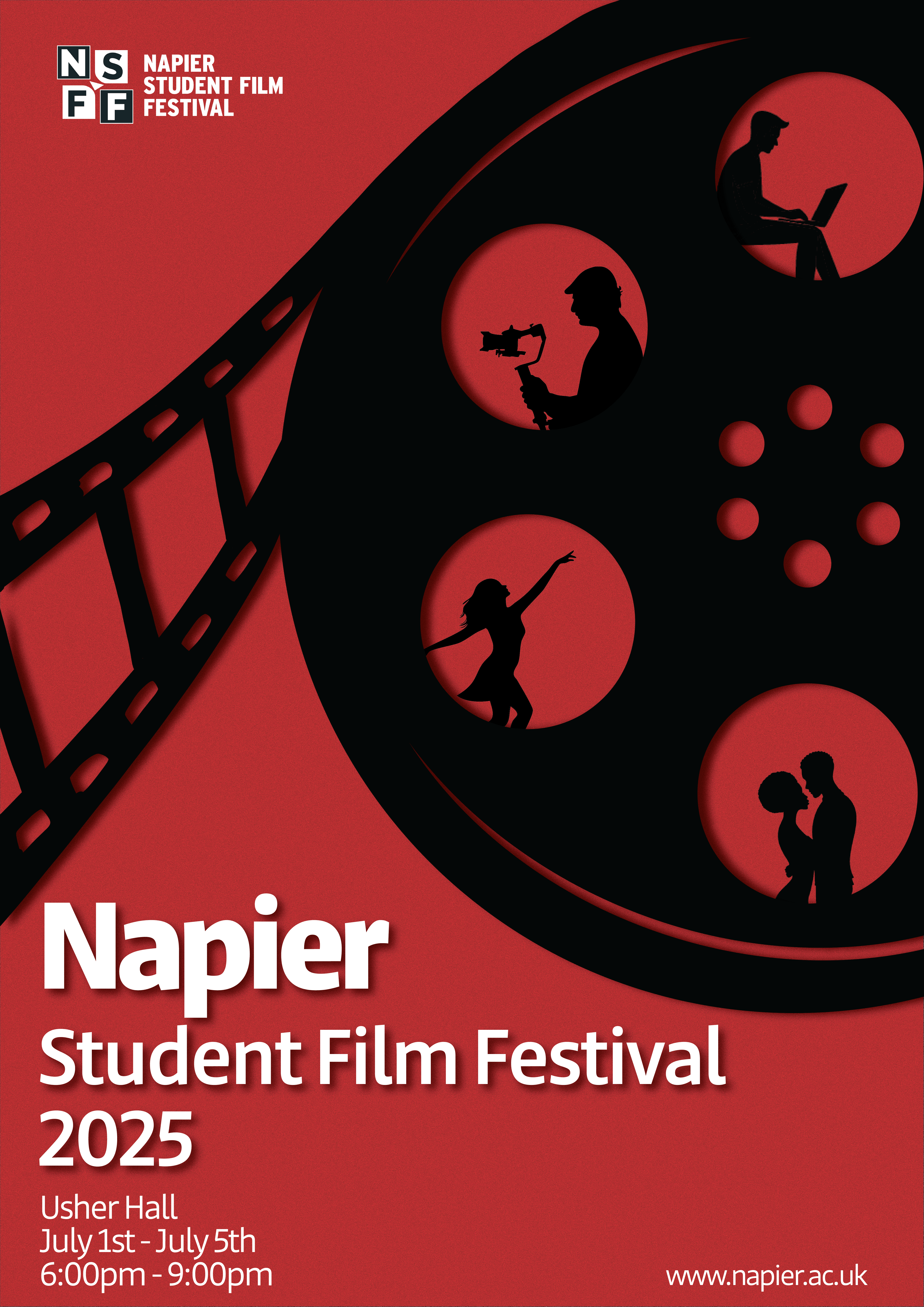
The Result
The final stage focused on polishing the design through subtle yet intentional adjustments. I refined the colour palette, fine-tuned typography and kerning, and made layout enhancements to create a balanced composition, and added film grain. These final tweaks ensured that the poster not only communicated the core message clearly but also maintained a strong visual identity aligned with the theme and purpose.
3